

Yes, while the Creative Director at a B2B software company, this was the actual feedback we received to a “sponsorship goal”-type thermometer graphic we’d designed. I mean, sure, there are potentially other more obscure treatments of a thermometer, but it was a pretty unconventional request, given the objectives for the piece.
Giving (and receiving) creative feedback can be tricky. It’s often less about pride and more about honing in on something meaningful that will connect with the audience. Sometimes it’s challenging to verbalize what it is you want to see, especially to us “visual” creative people!
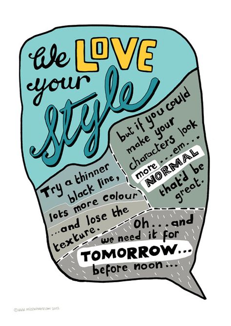
This site – https://cargocollective.com/sharpsuits – is an oldie but a goodie. These were posters created by designers to show some of the worst requests they’ve gotten from clients*. I’ve shared some of these amazing posters at two different companies I’ve worked at while trying to show “non-creatives,” i.e., our stakeholders, what it is we get as feedback quite often.
This is one of my favorites, and a good talking point for this discussion:
Usually, great designers are taking a ton of different elements into consideration when creating new work. There are headlines, subheads, bullets, images, callouts, logos, banners, calls-to-action (CTAs), it goes on and on. Working all that into a piece (within size and brand constraints, of course) takes a lot of work, and trying to tweak 10 different items on the page with very prescriptive directions can just keep throwing off element after element.
I often ask internal and external clients to instead think about what it is the design isn’t getting across that it should be:
- Are you not seeing the CTA prominently enough? Great, let us know.
- Are you worried that the headline is not connected well enough to the image? Got it!
- Do you need a different secondary color or image to be used based on a target market preference? Absolutely!
Changes are rarely an issue, but letting us know WHY you need it changed will lead to:
- Much more productive time spent by the designer.
- A more strategic solution to the problem than you may have originally thought of.
- A better understanding of your needs/preferences so the designer will do even better work for you next time.
Cycling through bolding or italicizing fonts when perhaps it just needed to be larger or accented through color will cause churn and delays. And let’s face it, you don’t have time for that! Maybe you asked for a caption on an image, and it just looks too small, but it’s within your brand and that’s why the designer created it that way. Instead of just asking for the size to be increased, maybe that caption really needs to be a callout/sidebar and that is a whole different situation.
Designers are thoughtful, creative people who usually want to get it right the first time. But if they don’t, maybe letting them use their expertise to meet your goals will be better for everyone in the long run…you have more important things to do anyway.
*This was especially awesome as the Irish creative community that worked on these posters had such fantastic public response that they held an exhibition with all proceeds going to Temple Street Children’s Hospital.